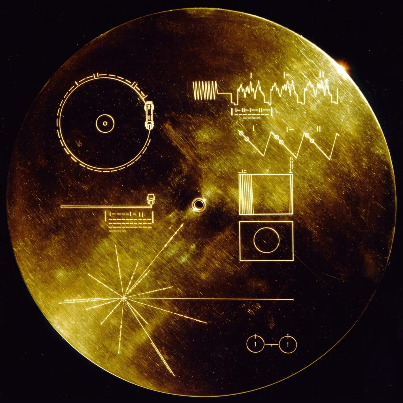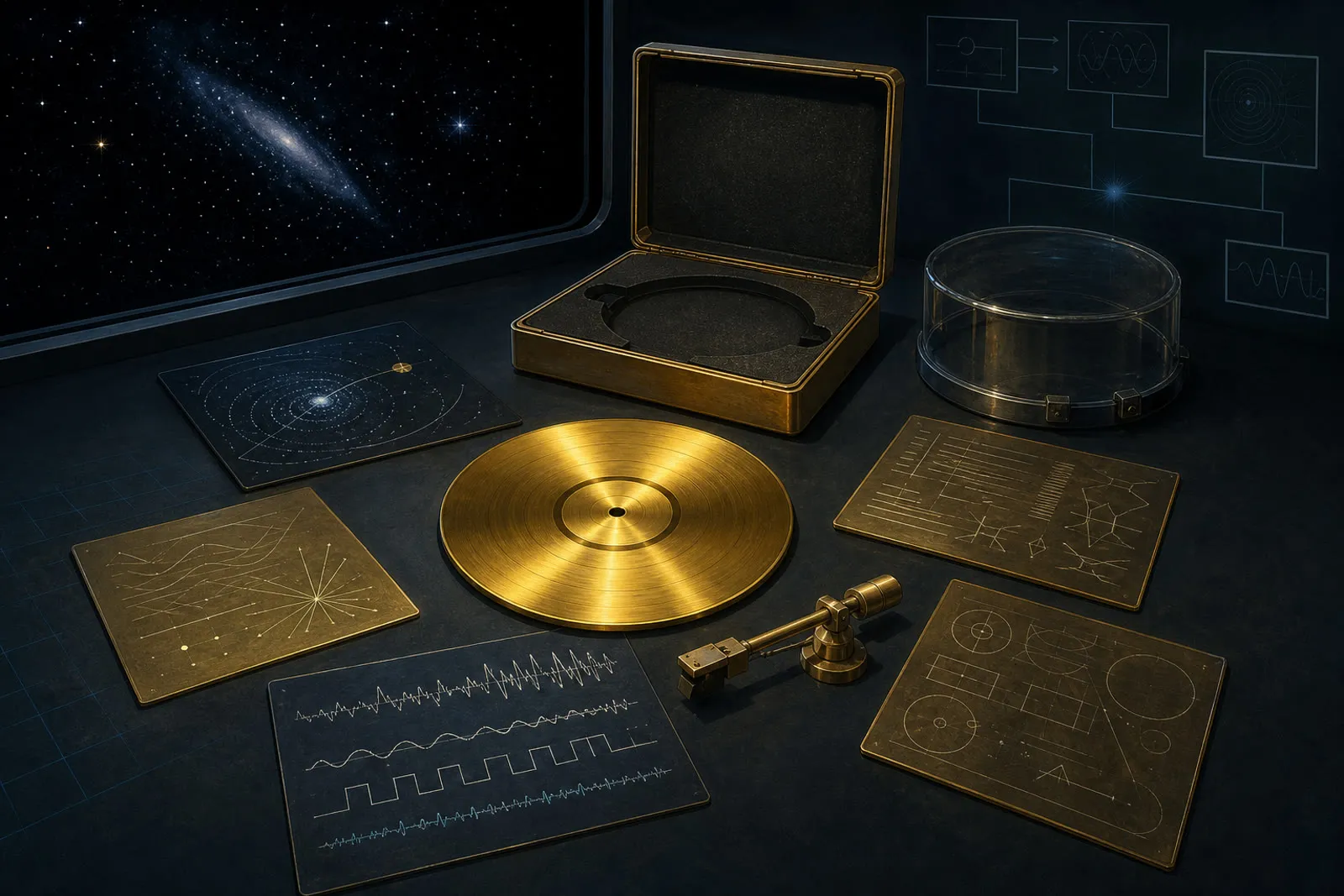

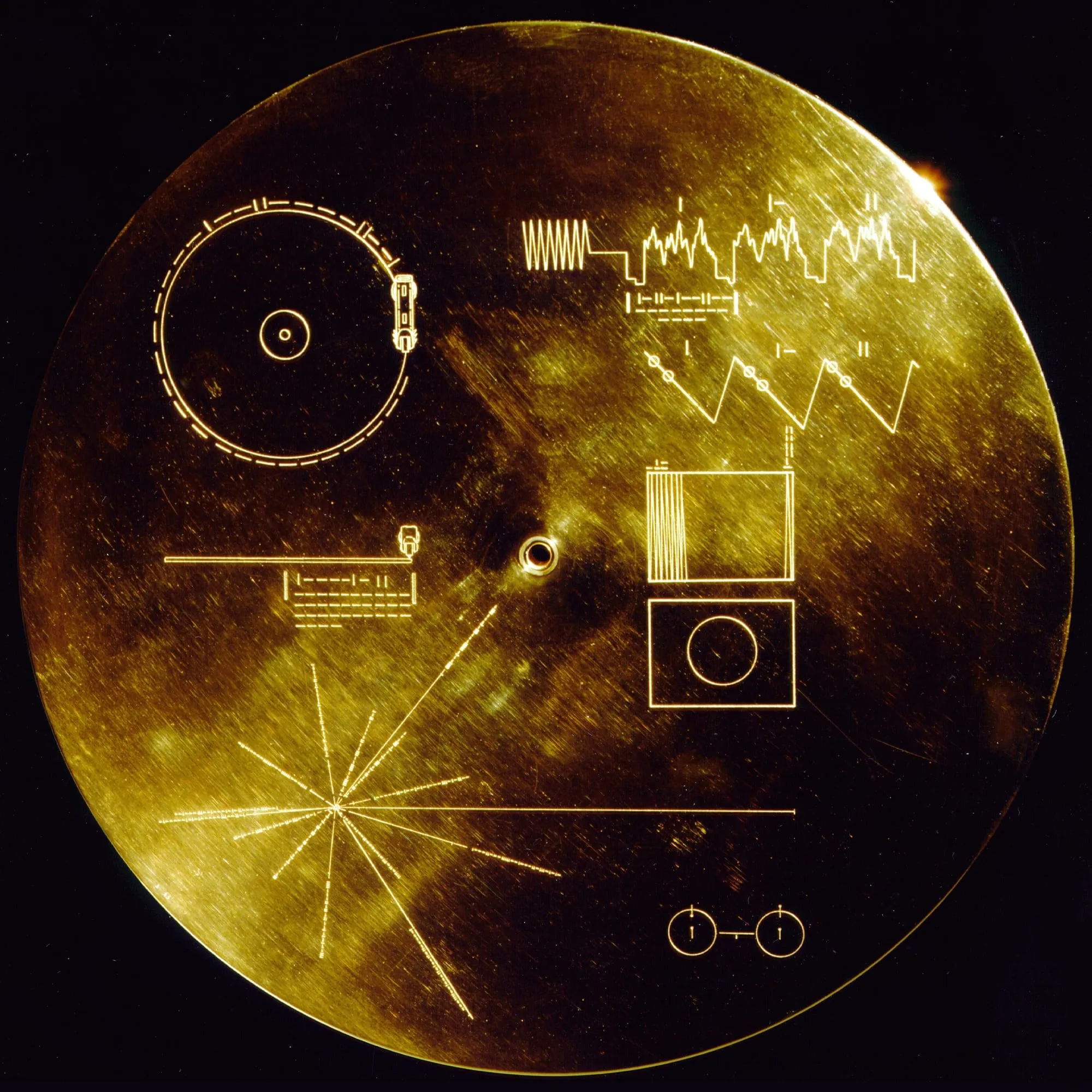
The Voyager Golden Record cover has no title, artist name, track list, logo, or picture of Earth. Its lines are not meant to attract a buyer. They are an attempt to teach an unknown finder how to operate an unfamiliar object without relying on a shared language. The design begins with physics because physics is the only common reference its makers felt able to assume.
That premise is both audacious and narrow. A recipient must notice the spacecraft, recognize the cover as information, infer that the attached stylus belongs to the disc, understand the diagrams, build playback equipment, decode analog pictures, and choose to continue. The cover does not solve first contact. It lays out a chain of testable instructions and makes its assumptions visible. 1
A record mounted outdoors
Voyager 2 launched on August 20, 1977; Voyager 1 followed on September 5. Each spacecraft carried an identical twelve-inch gold-plated copper disc in an aluminum protective jacket, along with a cartridge and stylus. The probes were built to study the outer planets, not to deliver records. The message was a small addition to a large scientific mission. 2
The placement changes the design problem. On Earth, a record can depend on a sleeve, player, electrical standard, retail category, and a listener who already knows what grooves do. Voyager had to carry enough of that missing system with it. The cover protects the disc from micrometeorite damage while its engraving describes the basic operations.
Instructions appear on the inner and outer surfaces so erosion of the exposed diagram does not remove the only copy. Repetition protects the instructions against time and abrasion.
The first mark needs a clock
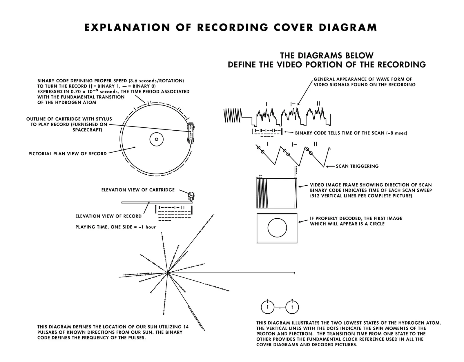
At upper left, a circle represents the record and a smaller shape represents the stylus in its starting position. An arrow indicates motion from the outside inward. Marks around the circumference encode the time for one rotation: 3.6 seconds. 1
“Seconds” would be meaningless without a human standard, so the diagram does not actually use seconds as its foundation. The numbers refer to a transition between two states of neutral hydrogen, illustrated elsewhere on the cover. That physical event supplies a tiny unit from which longer durations can be built.
The design therefore asks the reader to move between parts. The hydrogen diagram defines a unit; binary marks apply it; the drawn stylus demonstrates the mechanical action. No panel is fully independent. Understanding is expected to emerge through cross-checking.
Why a phonograph survived the future
A grooved analog disc may seem an odd container for an interstellar message launched during the digital age’s early development. Its operation is physically inspectable. A groove varies continuously, a stylus traces it, and that motion can be converted into a signal. The object exposes more of its own principle than a compact digital storage system would.
The record plays at 16⅔ revolutions per minute, half the common 33⅓ rpm LP speed. The slower rate increased capacity, allowing more than fifty minutes of audio and encoded images per side. It traded some fidelity for duration, a decision appropriate to a disc carrying greetings, natural sounds, music, and pictures rather than a commercial album mastered for home hi-fi. 5
Durability also mattered. Gold plating protects the copper substrate from corrosion, and the jacket shields the grooves. The claim that the object can last immensely long does not guarantee discovery or playback. It means the physical message may outlive the civilization that selected it.
Turning sound into a picture
The upper-right diagrams address a harder problem. Audio playback yields a changing signal, but part of the disc encodes images. The cover must explain how to turn that one-dimensional sequence into a two-dimensional field.
A waveform identifies the synchronization pattern at the beginning of a picture. Successive image lines are numbered in binary. Another drawing indicates that the lines should be stacked vertically with interlace, and a raster diagram specifies 512 vertical lines. The first decoded image is a circle, provided as a calibration check. If it appears oval, the reconstruction’s aspect ratio is wrong.
This section behaves like a compact technical manual. It gives a start signal, sequence, line duration, spatial arrangement, total count, and test pattern. The circle does not depict culture. It verifies process before culturally specific pictures arrive. 1
The map that changes with time
At lower left, lines radiate from a central point representing the Sun’s location. Fourteen lines refer to pulsars, rapidly rotating neutron stars whose radio pulses have distinct periods. Binary numbers identify those periods. A fifteenth line indicates the direction from the Sun to the center of the Milky Way.
The map is not a street address printed forever. Pulsar periods change. A technically capable finder could compare the engraved values with observed values to estimate how long ago the record was made. The same information helps locate the solar system through the relative positions of multiple pulsars.
Fourteen pulsars give a finder several points of comparison. One could be ambiguous or unavailable; together they create a pattern. The cover treats location as a relationship among clocks, not as a human name for a star.
A second clock made of decay
NASA added a tiny source of uranium-238 to the cover. As uranium decays into daughter isotopes, their ratio changes predictably. Measuring that ratio could provide another estimate of the time since the material was placed aboard. The half-life is about 4.51 billion years. 1
The uranium clock is easy to miss in photographs because it is material rather than primarily pictorial. It checks the pulsar-based epoch through a different physical process. The design does not assume one elegant diagram will be understood perfectly. It supplies independent evidence where weight and space permit.
The pulsar map and uranium clock give a finder independent ways to estimate age. If one source of evidence has degraded, the other may still be usable.
The content committee
NASA asked a committee chaired by Carl Sagan to assemble the record. Frank Drake served as technical director, Ann Druyan as creative director, Timothy Ferris as producer, Jon Lomberg as designer, and Linda Salzman Sagan organized greetings. The project combined engineering, astronomy, music research, rights clearance, recording, and graphic design. 3
The disc contains natural and human-made sounds, greetings in 55 languages, musical selections from many traditions, images, and printed messages from President Jimmy Carter and United Nations Secretary-General Kurt Waldheim. NASA’s pages differ in some image counts depending on how items and calibration material are classified, a useful reminder that even an official inventory depends on definition.
The cover says nothing about why one song was chosen and another excluded. Its job is operational. Cultural selection happens inside, where a small American-led committee attempted to represent a planet under strict time, rights, and production constraints.
Sequence created another form of representation. A listener would not receive separate national pavilions or a ranked history of music. Contrasting traditions share the same physical groove, and the order makes one selection become the immediate context for the next. The sequence therefore makes a curatorial claim even though the cover offers no track numbers.
The spoken greetings pose a related problem. Fifty-five languages demonstrate linguistic range, but a recipient cannot infer an entire grammar from a short salutation. Their clearest information may be vocal rather than semantic: human bodies produce patterned sound in many different ways. The record offers examples instead of a dictionary.
A portrait shaped by 1977
The record is often described as humanity’s message to the universe. A fuller description is a 1977 proposal about what humanity could send. Languages, instruments, and images broaden the selection beyond the United States, but no committee could sample the world without omission or bias.
Copyright shaped availability. Political institutions supplied official greetings. Scientific optimism during the Cold War shaped the preference for a legible, peaceful portrait. The project’s limits do not make it worthless; they make it historical. The disc reveals its makers as much as its chosen content reveals Earth.
The Library of Congress essay on the record places Sagan’s ambitions alongside environmental and humanitarian concerns and notes the difficulty of licensing and coordinating material. The final sequence was made through negotiation, not through an objective planetary playlist. 6
The cover as anti-brand
Commercial record sleeves establish identity quickly. A name and image help a customer recognize the product before playback. Voyager’s cover cannot assume recognition, a customer, or even sight comparable to human vision. Its etched lines are closer to equipment markings and scientific figures than album art.
Yet the object is visually distinctive on Earth. Gold, circles, binary marks, and the pulsar starburst have become icons reproduced on posters, tattoos, reissues, and merchandise. A design made to avoid cultural shorthand has acquired its own culture.
That afterlife changes how humans now see the original. We recognize “the Golden Record” before reading a single instruction. The hypothetical extraterrestrial reader has none of that brand knowledge. For them, every relation would have to be inferred from the object.
The duplicate in a museum
The National Air and Space Museum holds a duplicate cover transferred by NASA in 1978. In the museum, the object sits within labels, controlled light, catalog data, and a human institution that explains its significance. The situation reverses the spacecraft’s design problem: context is abundant, while physical playback is not the visitor’s task. 4
The duplicate also makes production visible. Voyager carries two covers beyond the heliosphere, but Earth retained examples, photographs, documents, masters, and later reproductions. The message was never only outbound. It became an artifact through which people on Earth discussed representation, technology, and long duration.
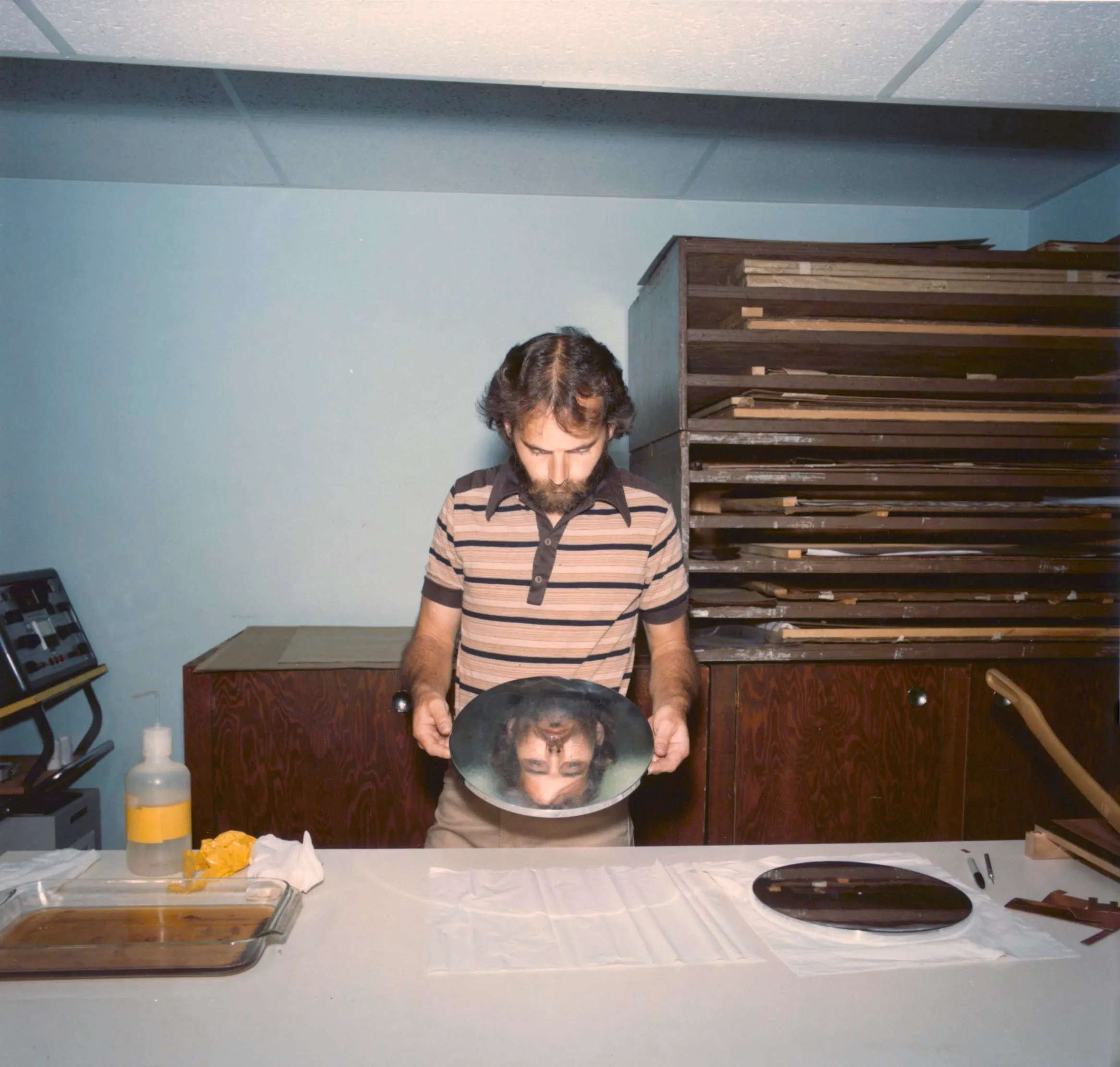
Production photographs show technicians etching and assembling the metal parts. These images puncture the impression of an object arriving fully formed from a single idea. The cosmic message passed through a workshop.
A successful instruction with no confirmed user
No extraterrestrial recipient is known to have found either record. That absence does not allow a usability test. Engineers and scholars on Earth can interpret the diagrams because they share scientific traditions with the designers. An unknown reader might not divide the image, identify the stylus, or privilege hydrogen in the same way.
The engraving makes its reasoning visible. It does not write “play this at 16⅔ rpm” in English and call the task complete. It defines time, shows movement, explains signal reconstruction, supplies checks, maps an origin, and dates departure.
There is also no “correct” orientation marked by a familiar top edge. A finder has to establish relationships among the panels and the circular object. On Earth, museum labels and photographs quietly restore an up and down. In space, the diagram must work without gravity giving the design a preferred reading position.
Most covers tell a listener what a record means before it starts. Voyager’s cover asks a more basic question: can the finder make the object produce a signal at all? The answer has been traveling since 1977, still attached to the instructions.